Bad Idea: STEREO TYPEThe omnipresent embarrassment of “exotic” type.
( 1 ) Seals is currently working on a typeface inspired by the infographics of W.E.B. Du Bois. Du Bois’ data visualisations were designed for the 1900 Paris Exposition to commemorate the lives of African Americans at the turn of the century, and to expose the structural forces of oppression that were denying African American progress.
Vincent Connare, the creator of Comic Sans, has long defended what is widely considered the world’s worst font. People who dismiss the childish font “don’t know anything about design,” he told Dezeen in 2014.
There has been no such vocal defense of so called “ethnic typefaces,” those which appropriate the aesthetic flourishes of foreign scripts to suggest that a brand has exotic origins. Yet they continue to be part of the visual noise of Western countries, screaming out from food labels, restaurant menus and posters. To anyone familiar with the alphabet being aped, they are about as authentic as the British tourist who wishes his companions bone apple tea prior to eating.
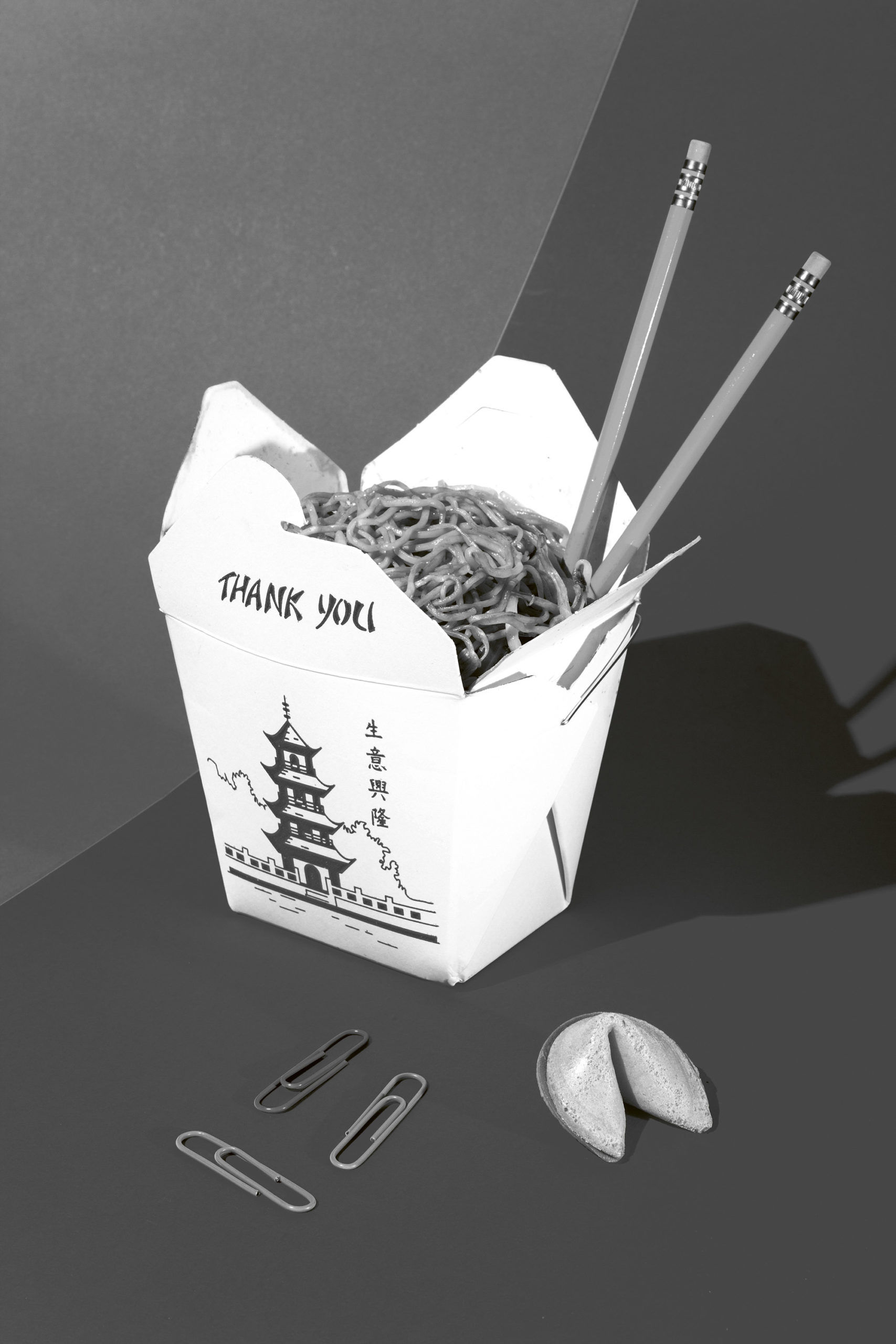
So-called “chop suey” fonts, which mimic the brushstrokes of Chinese handwritten characters, have been around in the US since the 19th century—as much an American invention as the food it is named after. On Indian products, you’ll see typefaces that fecklessly incorporate the horizontal connecting line used in Devanagari text, while Middle Eastern connections are often suggested using fantastical imitations of Arabic calligraphy. In some instances, letters are substituted with ones that look similar—the Greek sigma (Σ) and omega (Ω) instead of “E” and “O,” for example. This confusing practice becomes more egregious when the letters bear no phonetic similarity, such as the Cyrillic Я (pronounced “ya”) and И (pronounced “I”) for R and N.
It’s clear why these fonts become popular, even adopted by ethnic groups themselves as an easy way of marketing businesses to foreign audiences, but it’s also obvious why they’re increasingly shunned. The use of cultural stereotypes, often in combination with lazily conceived imagery, feels uncomfortable, especially given the lack of ethnic diversity in the graphic design and advertising establishments.
The use of such fonts have long inculcated a narrow and small-minded view of non-Western cultures. “All type and design is subliminal, no matter how monotonous or garish,” said designer Tré Seals, in a 2019 interview. He set up Vocal Type, a foundry that strives to “introduce a non-stereotypical piece of minority culture into graphic design, taking inspiration from protest signs at such events as the American civil rights marches, anti–Vietnam War protests, battles for women’s suffrage and Stonewall riots.”1 His goal is to contribute to a graphic environment that “cares about telling the stories of the people we serve and not the false history of the industry we work in.”
( 1 ) Seals is currently working on a typeface inspired by the infographics of W.E.B. Du Bois. Du Bois’ data visualisations were designed for the 1900 Paris Exposition to commemorate the lives of African Americans at the turn of the century, and to expose the structural forces of oppression that were denying African American progress.
GOOD IDEA:
DIFFERENT STROKES
The awareness that fonts are not neutral, but come loaded with their own history and cultural reference points, is spurring designers to diversify the offerings available. Graphic designers on the African subcontinent (where the Latin alphabet is used de facto in many countries) have taken up this challenge with particular urgency. In 2014, the Zimbabwe-born graphic designer Osmond Tshuma created a typeface called Colonial Bastard Rhodes, created using type elements from racist advertising published during the British imperialist era. His typeface was explicitly made to draw attention to how loaded seemingly neutral lettering can be. As he later explained in an interview: “Colonialism was an act of brutality clothed in the farce of civilization.”
Other typefaces created in recent years attempt to replace the cartoonish “tribal” style of so-called African fonts with something more nuanced. The Kenyan graphic artist Kevin Karanja created Charvet in 2013, a typeface born of his love of ancient African typography and geometric shapes. Meanwhile, the iconic typeface of popular restaurant franchise Nando’s, which serves African-Portuguese food, was redone in 2016 by the sign writer and artist Marks Salimu, who painted the characters directly onto wooden panels. As a representative from the chain wrote at the time: “It not only tells the story of who we are and where we’ve come from, but importantly, it puts our people at its heart.”